
In this article:
- Add fields
- Move and delete fields
- Modify field labels and add placeholder text
- Add and customize answer choices
- Make fields required
- Offer to subscribe to different groups
- Add custom text or title
- Change form layout (side image)
- Add images or your logo
- Change the style of your fields
- Customize the design of your form
In this article, you'll find tips and tricks for creating a pop-up subscription form that suits your image.
Add fields
Learn how to add:
Regular fields
Regular fields are fields generated by default by the system and designed to receive basic information about your contacts. Here's the list of regular fields you can add to your form: surname, first name, gender, company, date of birth, zip code, country and note.
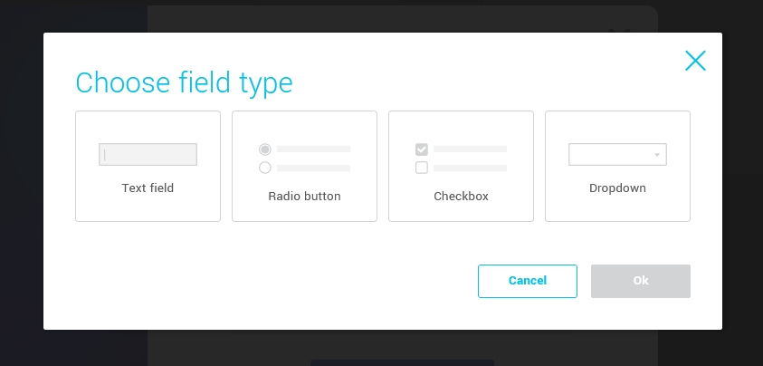
To add regular fields to your form, go to the side panel on your right and open the Content tab. In the Fields section, click on the field you wish to add and drag it directly to the desired position in your form.
.png)
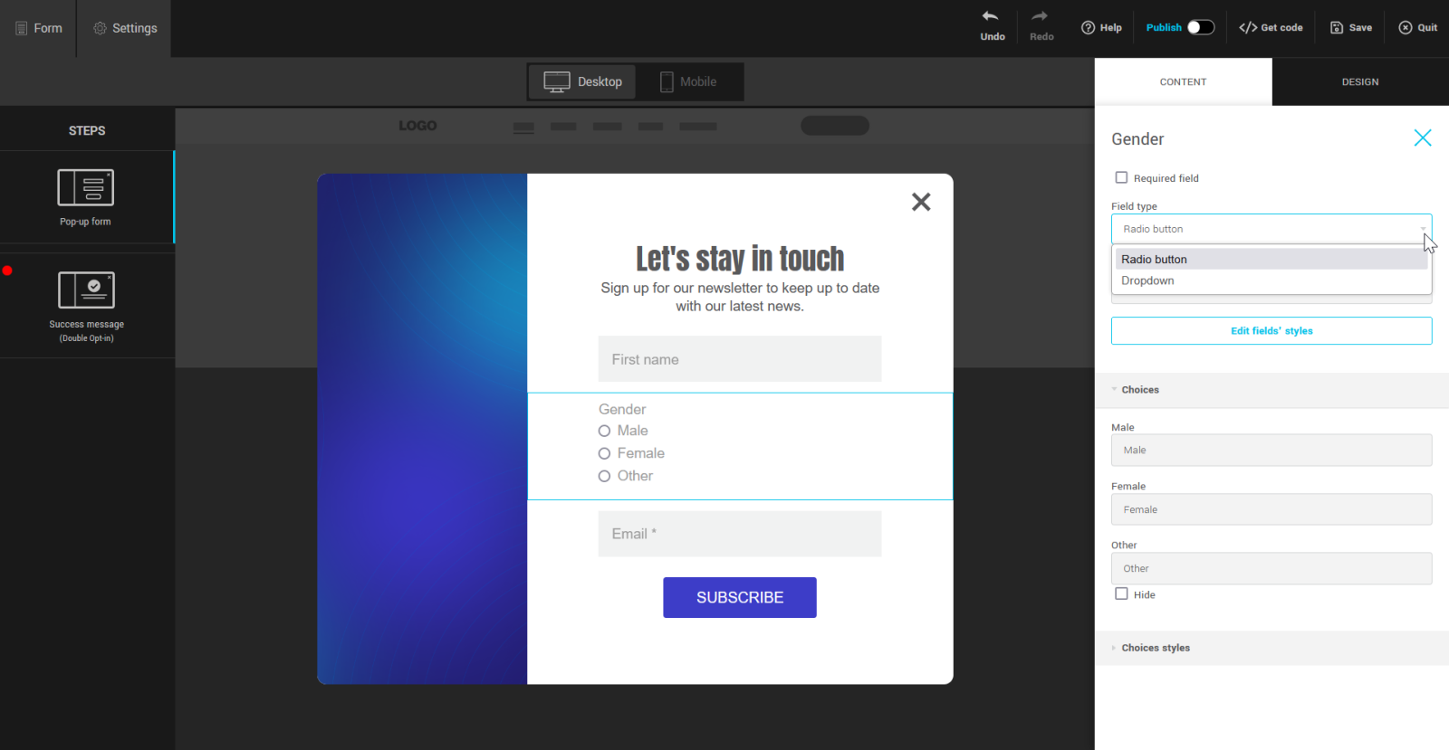
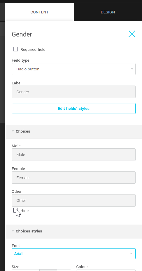
About the Gender field
When you add this field to your form, you can choose between two types of display for its answer choices: radio buttons or drop-down menu. There are also additional options in this field's properties that allow you to modify the wording and style of its answer choices. Keep in mind that the wording of answer choices must be meaningful in relation to the value associated with them. It is also possible to show or hide the choice Other.
Custom fields
In addition to the regular fields offered by default, it is possible to create other fields, known as custom fields, to store additional data that could be useful for personalizing your mailings or segmenting your contacts, for example. There are four types of custom field: text, date, integer and decimal. The number of custom fields available varies according to your plan. Learn more about custom fields >
To add custom fields to your form, go to the side panel on your right and open the Content tab. Under the Custom fields section, click on the field you wish to add and, holding down the mouse button, drag and drop it directly into the desired position on your form.
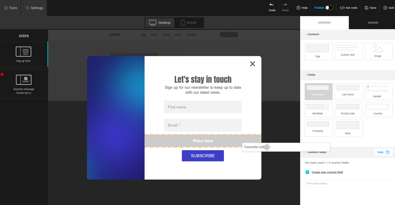
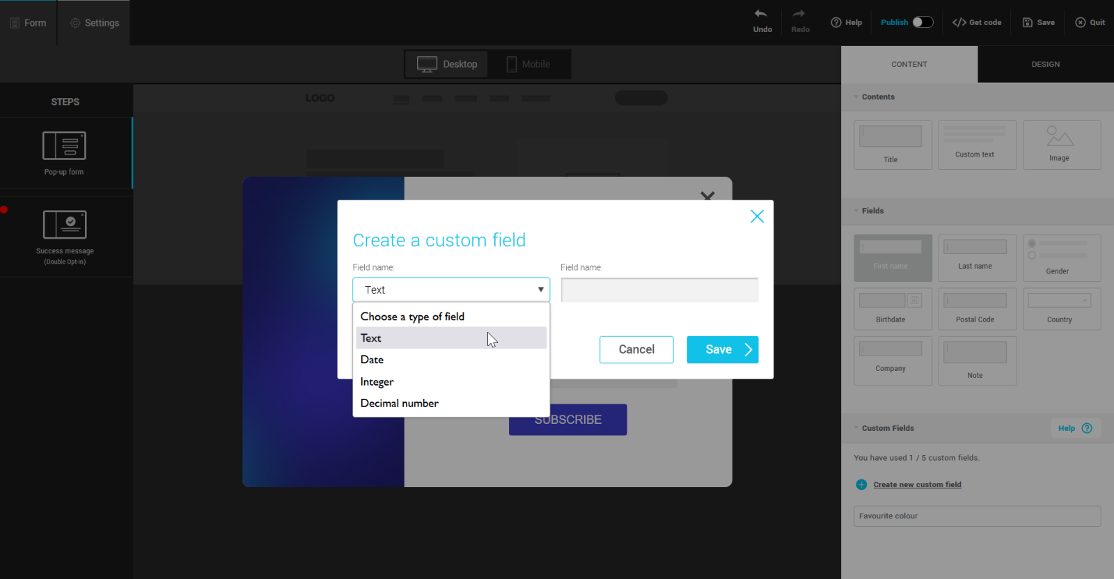
If the field you wish to add does not yet exist, click on the + Create new custom field link. Choose the type of field (text, date, integer or decimal) and give it a name. Then click on Save. The new field will be added to the list of available custom fields. You can then drag it into the form.
About custom text fields
When you add custom text fields to your form, you'll be offered several field types: text fields, radio buttons, checkboxes and drop-down menus. Choice fields allow you to predetermine and limit the possible results.
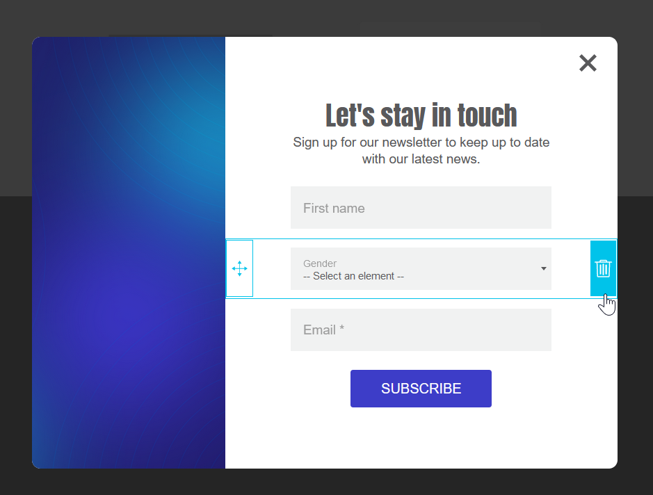
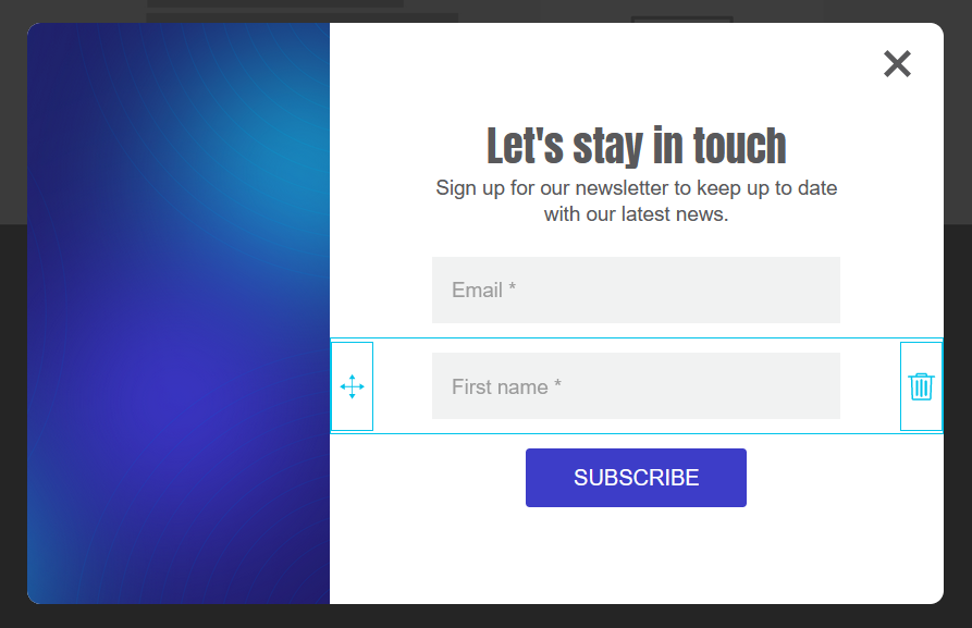
Move and delete fields
To reorder fields, hover your mouse over a row in the form preview and drag them into the desired order using the drag handle.
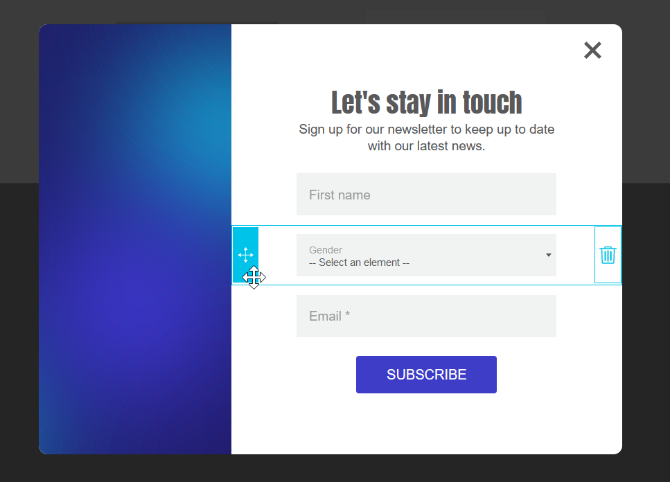
To remove a field, hover your mouse over a row in the form preview area and click on the trashcan icon to the right of the row. The only row that cannot be removed is the button row.
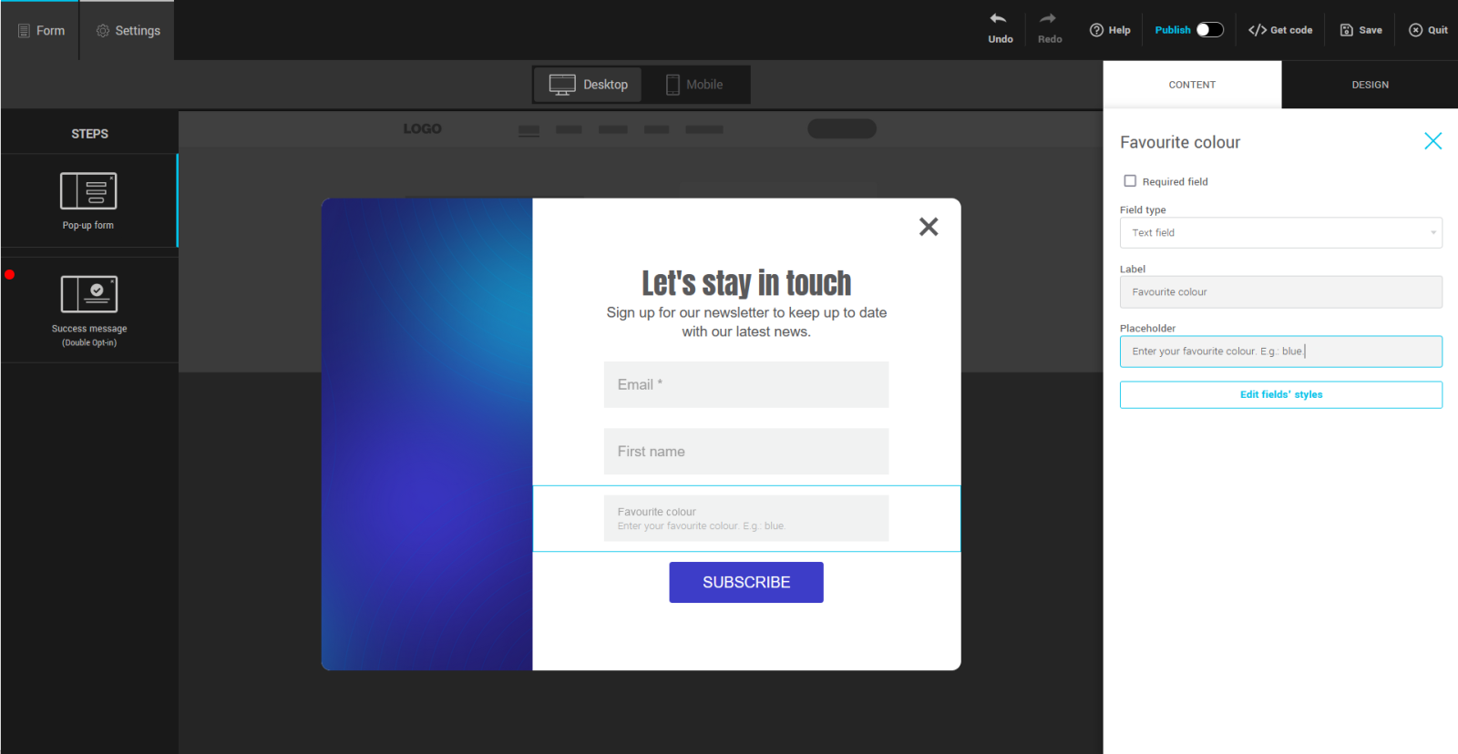
Modify field labels and add placeholder text
To modify these two elements, click on the field in the form preview to select it. Then go to the side panel in the field properties to make the desired changes.
The label is the text that identifies the field. You can customize it, but don't forget that it's important for comprehension.
The placeholder is a text that appears inside the field, if it's empty, to give the user more information. It is sometimes used to explain the expected format or give an example of a possible value. This text is optional.
Add and customize answer choices
You can customize the response options for the following fields: gender and custom text fields.
Learn more about:
Gender field
You can choose how the answer choices in this field are displayed: radio buttons or drop-down menu.
To modify a field, click on its row to select it. Then go to the side panel on your right to view its properties. Here you can modify the field type (radio buttons or drop-down menu) or the label of the answer choices. But you won't be able to add any. Remember to choose a meaningful label that corresponds to the value of each answer choice.
Check the Hide option to remove the answerOther in the gender field, if required.
Custom text field with multiple choices
Learn how to:
- Add a text field with answer choices
- Automatically generate and add answer choices from your contact data
- Manually add answer choices
- Reorder and delete answer choices
- Customize the value of answer choices
- Storing multiple choice answers
Add a text field with answer choices
Drag and drop the custom field into the form, then choose the desired field type: radio buttons, checkboxes, or drop-down menu. Press OK to confirm.
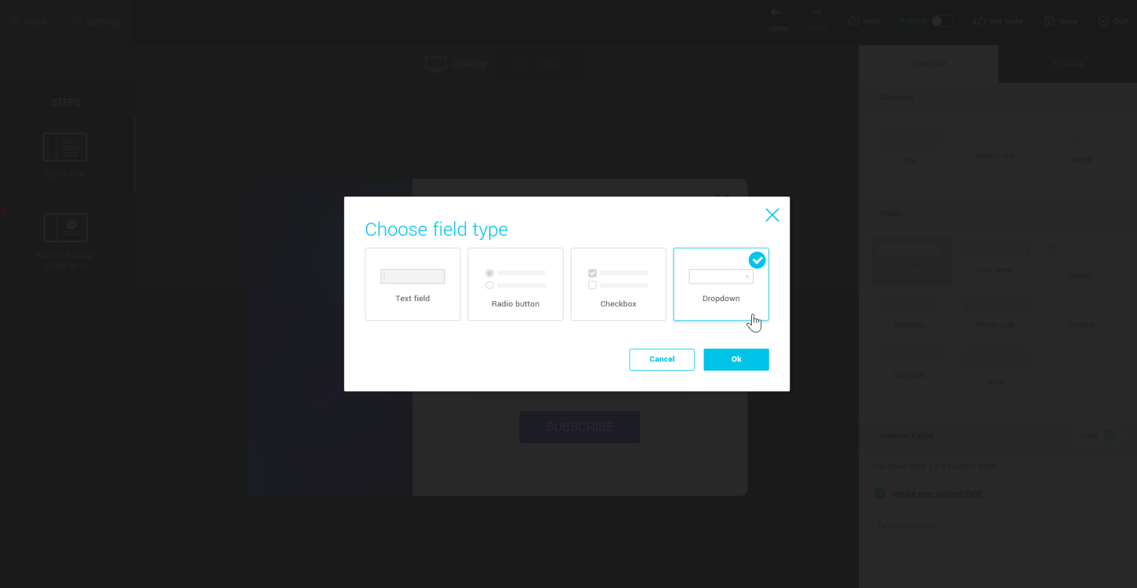
If the selected field currently contains data for one or more contacts, a window will be displayed and you will have the choice between:
- enter all your answer choices manually. Learn more >
- get auto-generated responses from your contact data. Learn more >
If the chosen field is currently empty for all of your contacts, it will be added directly into your form and you can manually add answer choices via the row properties in the side panel. Learn more >
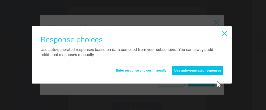
Automatically generate and add answer choices from your contact data
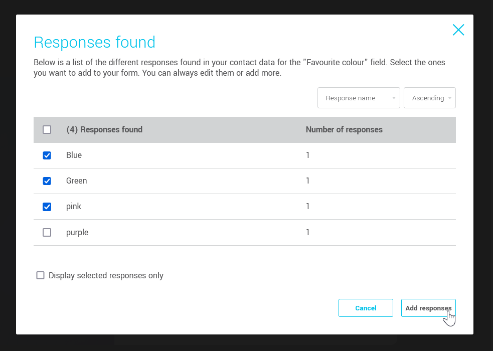
When you add a custom field that already contains data, it is possible to automatically generate answer choices from it. To do this, when adding the field, select the Use auto-generated responses. If your field has already been added, click Generate more responses in its properties.
In the Responses found window, check the answers to add. You can modify their wording or add others in the side panel, if necessary.
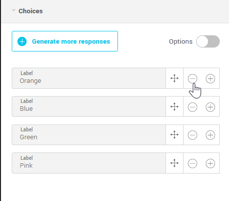
Manually add answer choices
Select the field row. Then, go to the side panel, under the Choices panel and click on the + to the right of one of these.

Reorder and delete answer choices
Use the drag handle to reorder an answer choice.

Click on the - to delete an answer choice.
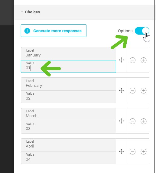
Customize the value of answer choices
Turn on the Options switch to give answer choices a value different from their label.
About storing multiple choice answers (check boxes)
If your contact checks several boxes, the values of all these answers will be added in the corresponding field, separated by commas. To search to see all contacts who chose an answer choice, use the “contains” operator and specify the value you are looking for.
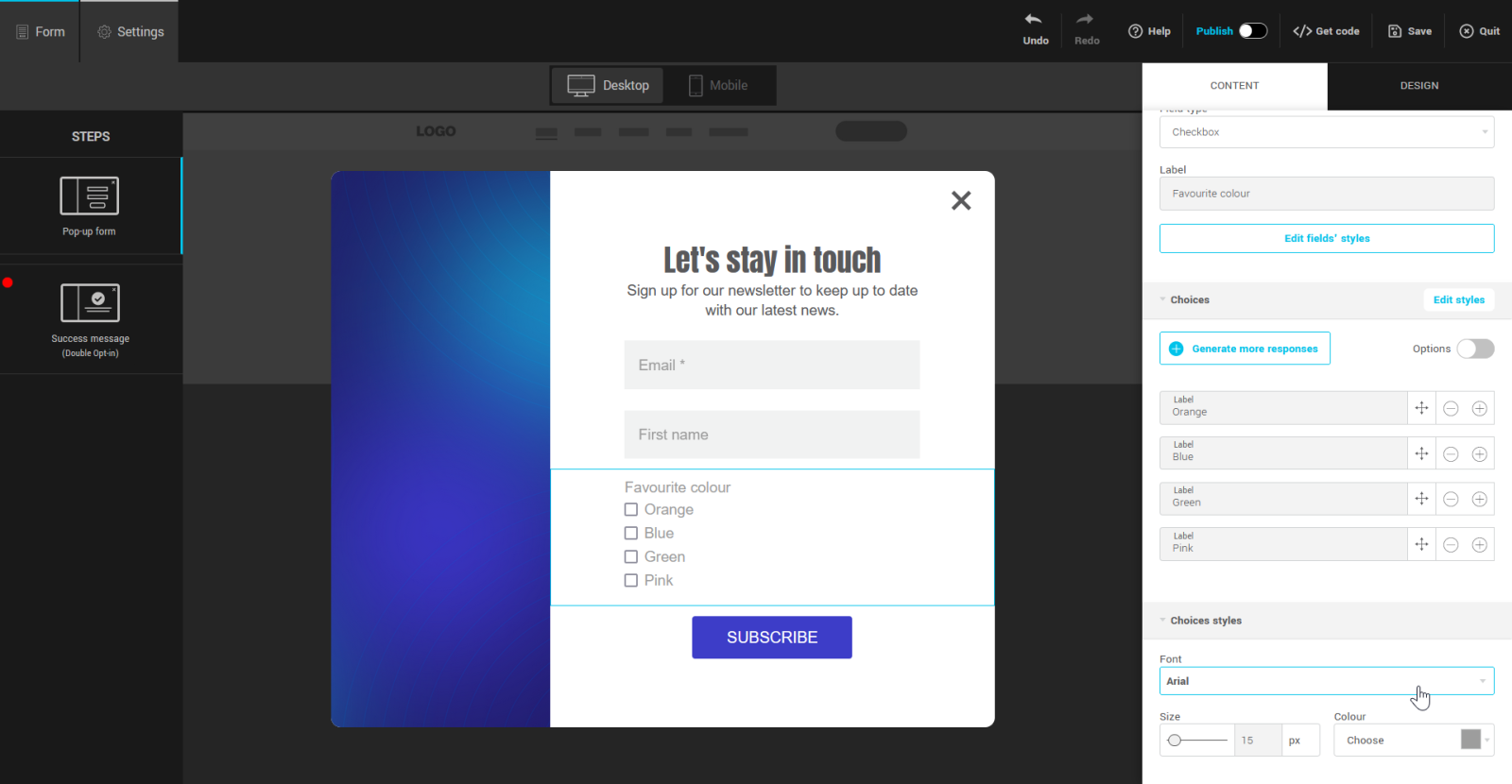
Customize the style of answer choices
To customize the appearance of answer choices (radio buttons or check boxes), select an answer choice row in your form and go to the Content tab in the side panel to your right to modify its properties. Then open the Choice styles panel, where you can modify their font, size and color.
Make fields required
Email and group selection (if displayed in the form) are the only mandatory fields by default. You can make other fields mandatory to complete by checking the Required field box in their properties.
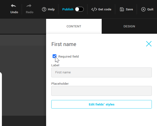
Mandatory fields are identified by an asterisk (*) at the end of their label.
Offer to subscribe to different groups
Learn how to:
- Add a choice of groups to the form
- Reorder the group list
- Edit group labels
- Edit the target group list
Add a choice of groups to the form
To add group choices to your form, go to the Settings tab located at the top left of the form editor and scroll down to the Subscription type section. Choose Multiple choices (checkboxes) or Single selection (dropdown list) to display a choice of groups in your form.
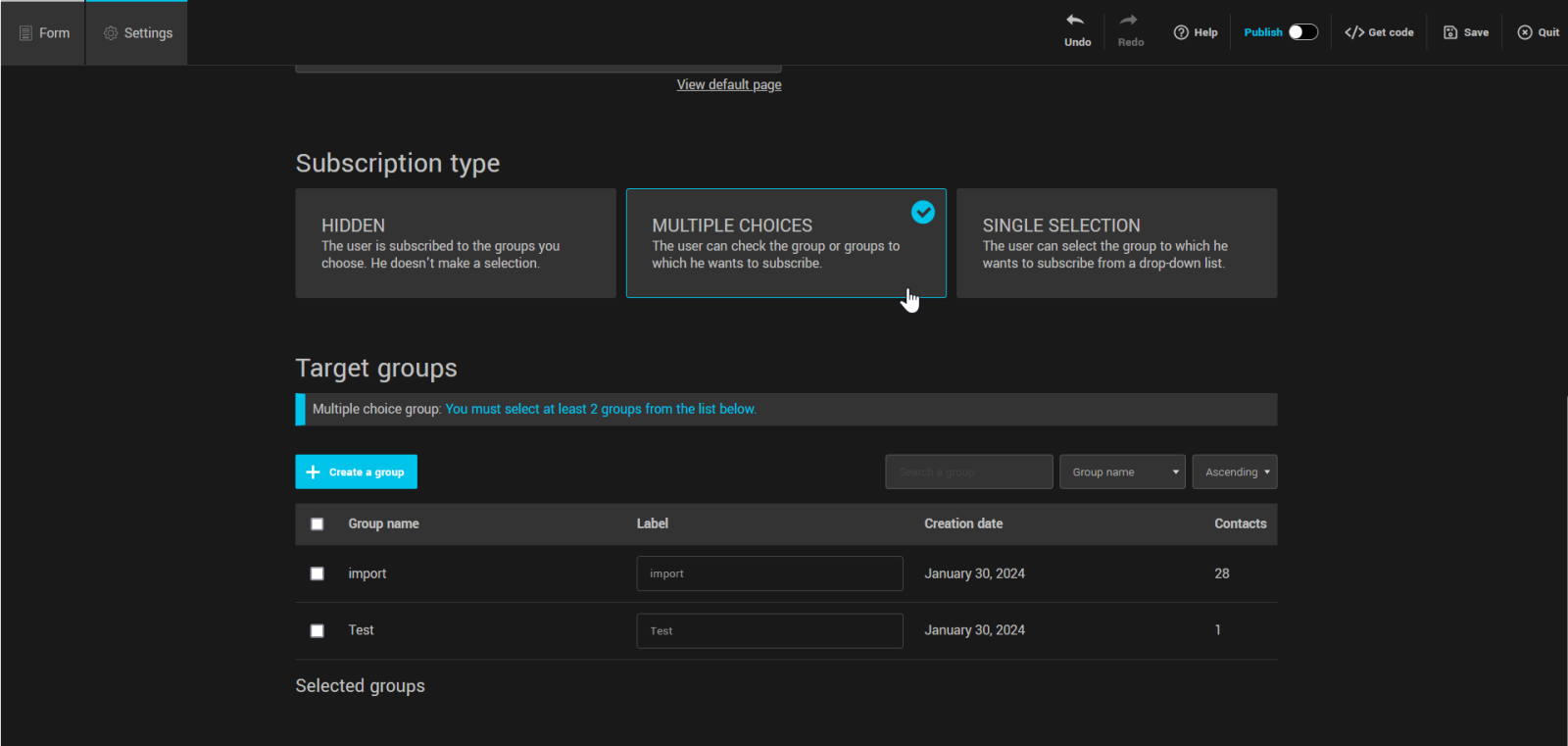
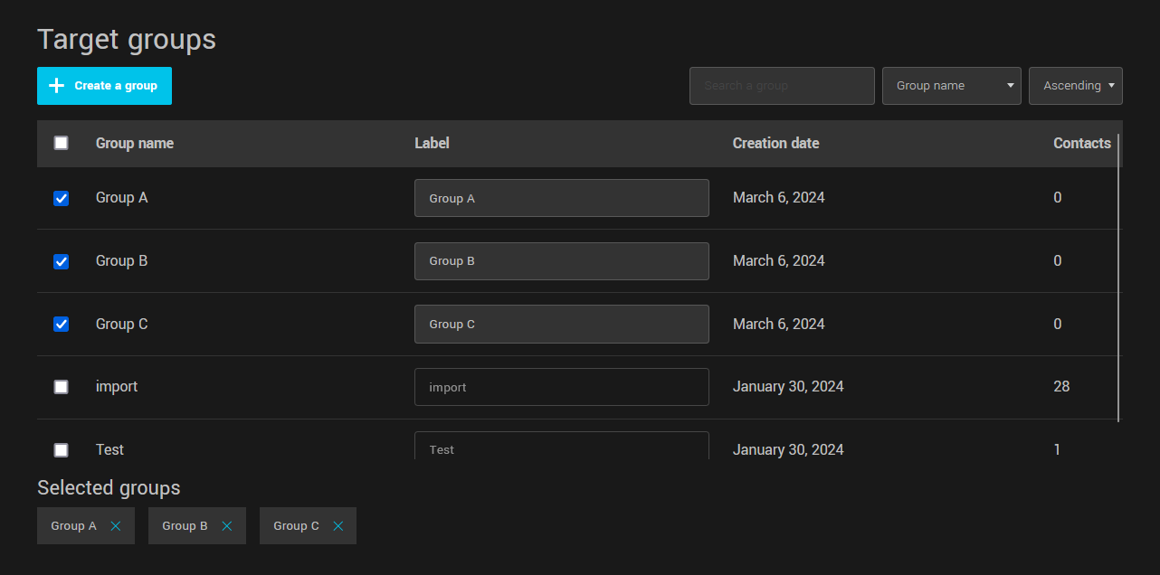
In the Target groups section, select the groups you want to display in the form. You can also create new groups here, they will be automatically selected to add to your form.
Reorder the group list
Return to the Form tab and select the Groups row. Then, go to the side panel to your right, under the Choices panel and use the move handle to reorder your groups.
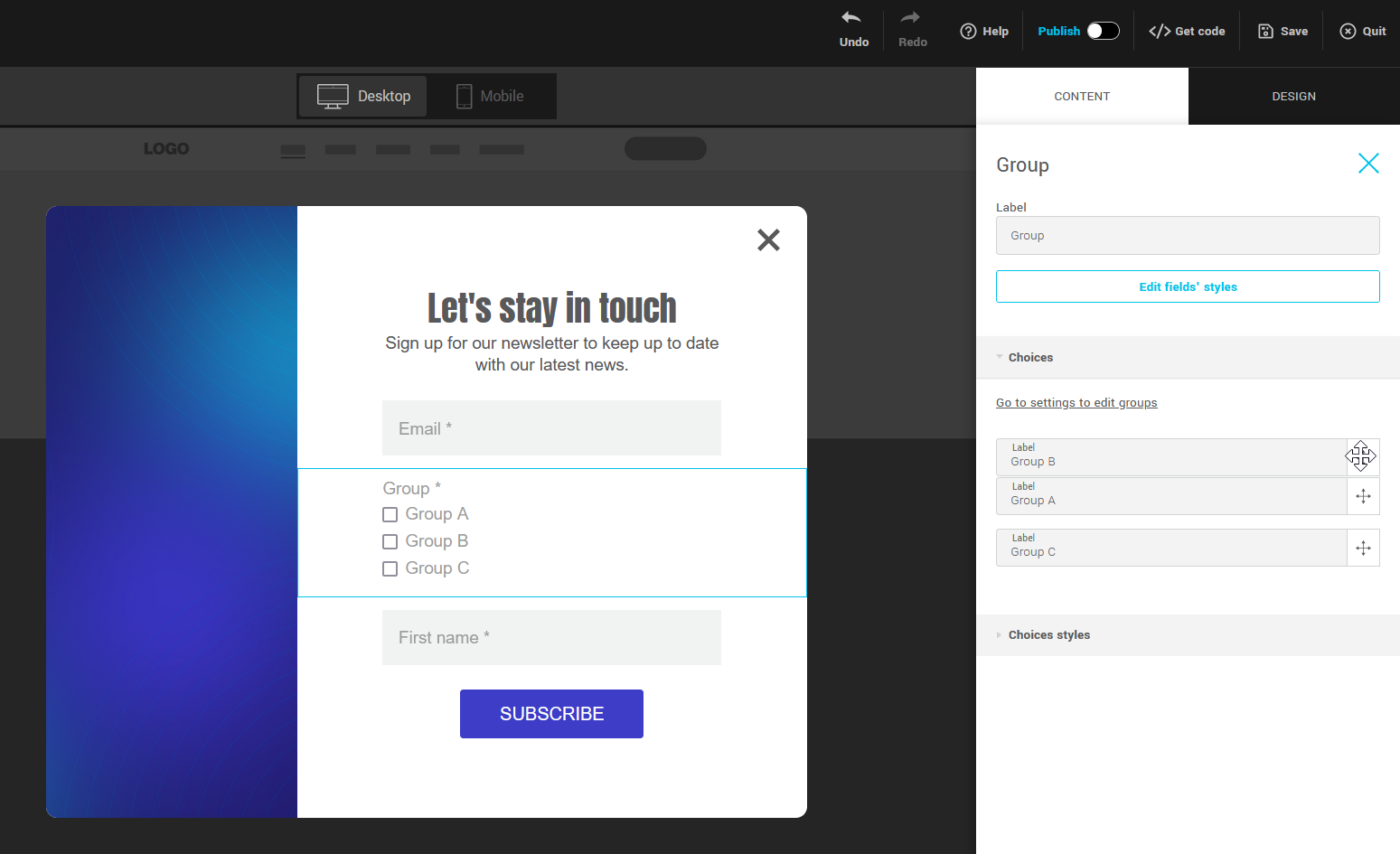
Edit group labels
The group label (private) can be edited in the Choices panel (in the row properties) or in the Target groups section of your form settings.
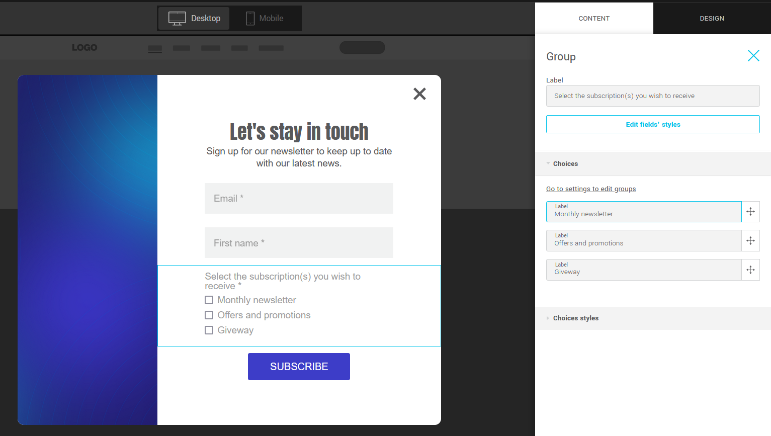
Modify the target group list
Click the Go to settings to edit groups link in the Choices panel (in the row properties) or go directly to the Target groups section of your form settings.
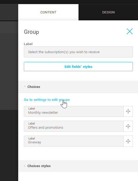
Add custom text or title
To add a title or custom text to your form, go to the side panel on your right and click on the Content tab. Under the Contents section, click on the element to add and while holding down the mouse, drag and drop it directly to the desired location in your form.
.jpg)
Customize text style
Select the row of the element to customize and use the tools available under the Text (or Title) styles panel. You can also adjust the spacing before and after.
In the rows of custom text, you have additional options that allow you to apply bold or italics, create links, bulleted or numbered lists as well as adjust paragraph alignment.
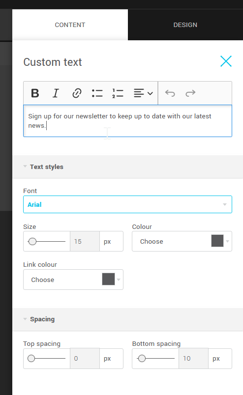
Change form layout (side image)
To change the layout style of your form, i.e. add, remove or change the position of the side image, go to the Design tab of the panel to your right, then to the sub Form tab.
Under Layout, choose the one you prefer.
To edit the side image, click on it to select it. Its properties will then be displayed in the panel to your right. Click Choose an image below its preview, then My Images to access your image directory (you can select an existing image or upload a new one) or click Image Library to search the image bank from Pixabay.
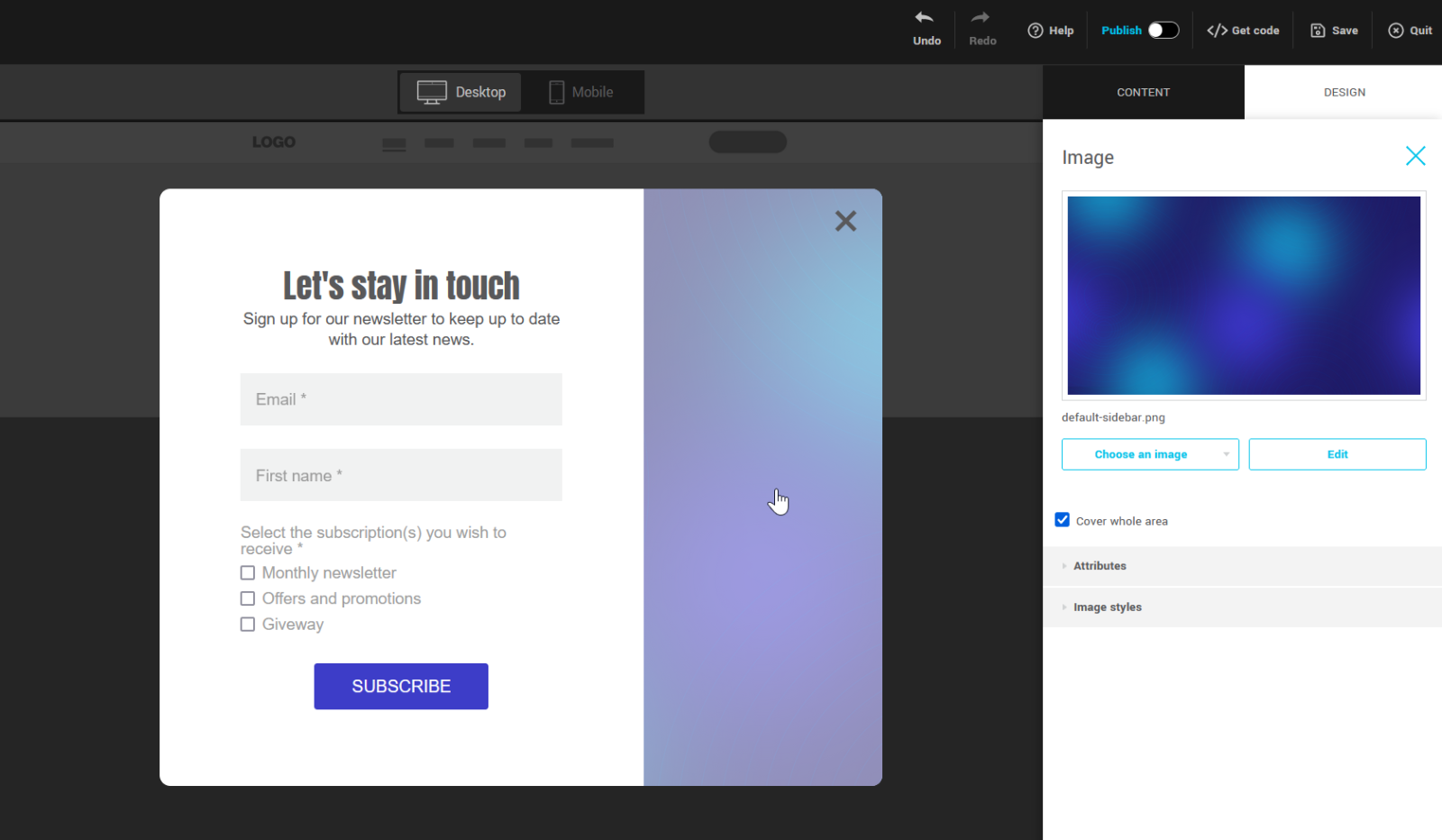
About the size and position of images in the sidebar
By default, when you add a side image to your form, the Cover whole area option is enabled by default. This option ensures that your image is displayed at 100% of the height of your pop-up form, while maintaining its proportions. So that your image does not appear stretched or crushed, if it is in "landscape" format for example, we will display only its central part, that is to say only parts of your image (left and on the right) will not be visible.
If you want to display the left or right part of your image, rather than its center, simply change its position. The option is located under the Image styles panel.
If the image is not tall enough to cover the height of the form, it will be enlarged while maintaining its proportions. Please choose a correctly sized image to ensure the best possible result.
To display your image at its original height, uncheck Cover whole area. This will also give you access to additional options like displaying the image with or without borders (borderless: your image will go up to the maximum width of the side image area) and adjusting the spacing around your image.
To line the background of your side image with a pattern (for example, a tile image), make sure you have unchecked Cover whole area and choose the preferred repeat option.
Image and accessibility
It is possible to add alternative text to your images. This is a phrase that replaces your image if it cannot be downloaded. This allows people with visual limitations or using screen readers to understand the content of the image.
Add images or your logo
Learn how to :
- Add one of your images or an image from the image library
- Modify an image
- Add a link to an image and alt text
Add one of your images or an image from the image library
To add an image to your form, go to the side panel on your right and click on the Content tab. Under the Contents section, drag and drop an Image element directly to the desired location in your form.
To add one of your images, select your Image row and open the Choose an image list in its properties, then choose My images. You can then choose an existing image or upload a new one.
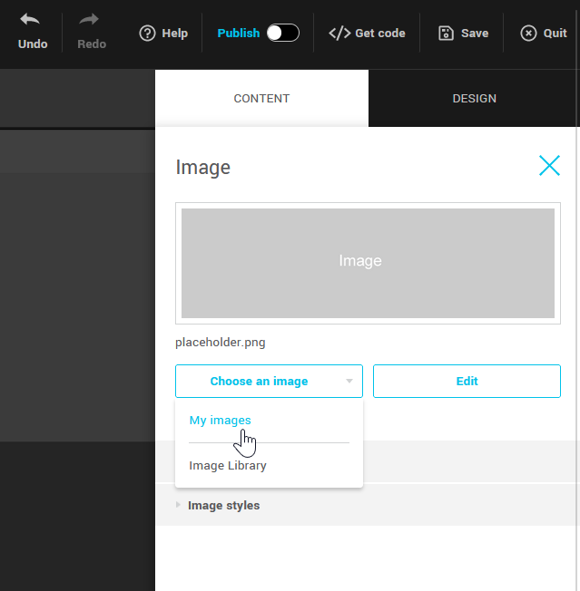
To use an image from the Pixabay Image bank, open the Choose an image list in the row properties and select Image Library.
.png)
Modify an image
To edit an image, such as cropping it or adding text to it, click the Edit button to access the image editor.
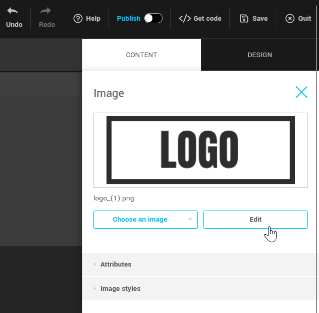
To change the styles of your image, such as its size in the form or its alignment, go to the Image styles panel.
From there you can:
- Remove or add margins
- Adjust its size and alignment
- Change spacing before and after
- Add Shading
- Define round corners
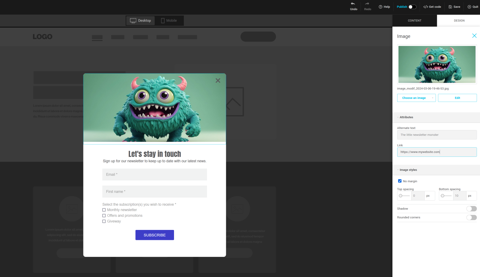
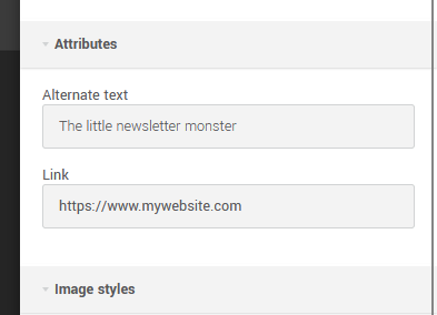
Add a link to an image and alt text
To add a link or alt text for your image, go to your image's Attributes panel.
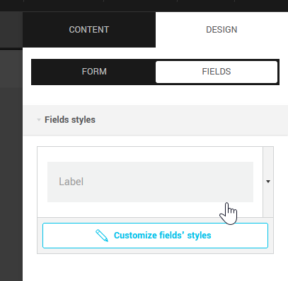
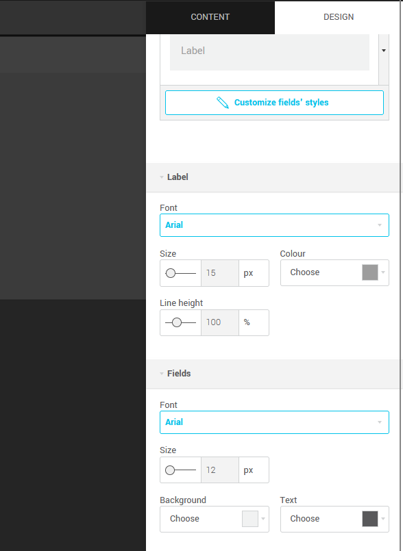
Change the style of your fields: styles, colors and fonts
To change the appearance of fields, click the Design tab, then the Fields subtab.
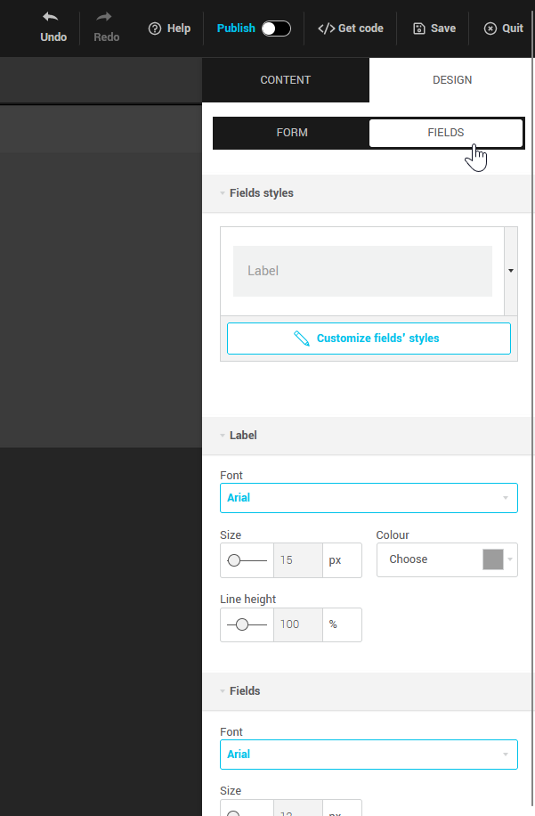
From there you can modify:
- field style: click on the field preview to open the list of available styles. Click the Customize fields' styles button to access advanced style options (such as adjustments to label position, round corners, border and field shading)
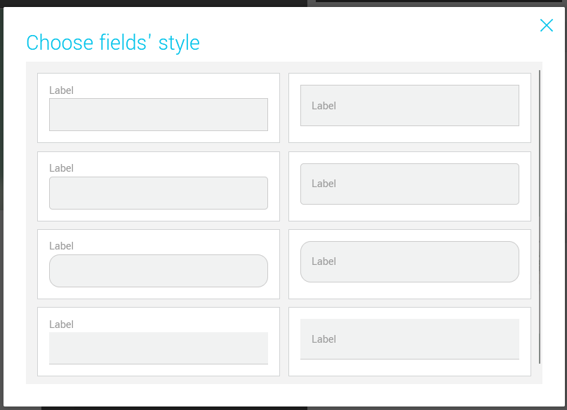
- the text style of labels and fields: font, size, color and line height
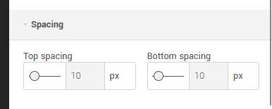
- the spacing before and after the fields
Customize the design of your form
To change the style of your form, click the Design tab, then the Form subtab.
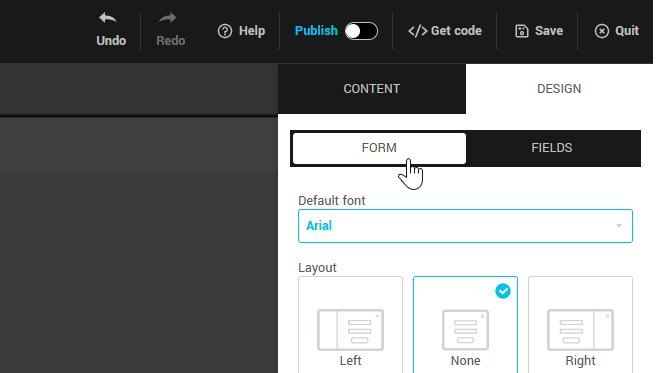
In this tab, you can:
- set a default font for your form
- modify its layout (with or without side image, image on the left or right)
- change its position on the page (centered with darkened background, bottom right or left (no background))
- choose how you want it to display (with or without animation)
- change the color of the form's overlay (background behind your form) - only if its position is centered
- change the color of the X to close the pop-up
- change its dimensions (the width of the form represents its total width including the side image, if there is one. The interior width is the same as that of the fields on your form.)
- change the roundness of the corners of the form (for square corners, change the number to 0px).
- set your background color
- add and personalize your form's border
- add shading around the form
.png)