
In this article:
The mobile version of your landing page is designed to display smoothly on mobile devices such as smartphones and tablets. The goal is to provide an optimal user experience by adapting page elements (text, images, buttons) to smaller screen sizes.
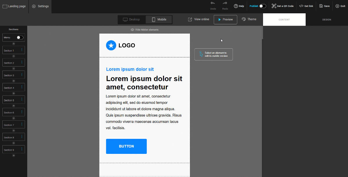
By default, the mobile layout automatically rearranges your page content into a single column. Elements are displayed one below the other, in the following order: from top to bottom and from left to right.
Before you begin
Why is it important to have a mobile version of my landing page?
The majority of users access the internet through their mobile devices. A well-designed mobile version allows you to:
- Provide a better user experience, with easily readable content and accessible interactive elements.
- Ensure smooth navigation across all devices, whether it’s a phone, tablet, or other mobile platform.
- Adapt the mobile layout without affecting the desktop version: changes made in mobile mode are independent, allowing you to optimize the mobile display without impacting the desktop experience.
How to proceed
- Create a new landing page or edit an existing one. Open the page editor.
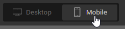
- Click the Mobile button to switch to the mobile preview of your page.
- Click directly on a section, column, or element (such as text or a button) to edit it. A blue outline indicates the currently selected element.
- Adjust the size of images, headings, paragraphs, and buttons to ensure they are well-proportioned for mobile screens.
- Set padding and inner alignment for each column.
- Don’t forget to save your changes frequently and before leaving the editor.
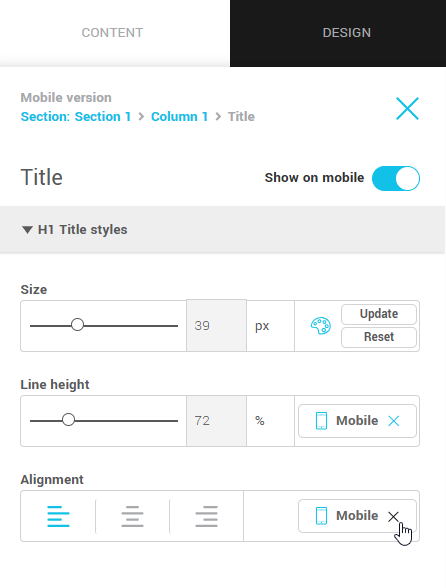
Set and reset mobile text theme
The theme applied to your landing page includes default text sizes tailored to each screen type: larger on desktop, more compact on mobile. This ensures comfortable reading across devices.
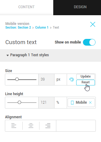
If you manually change the size of a heading or paragraph in mobile view, you can always revert to the theme’s default size.
Click the Reset button next to the text size setting to restore the mobile theme’s default size. The reset button only appears if you have modified the default size.
Hiding elements on mobile
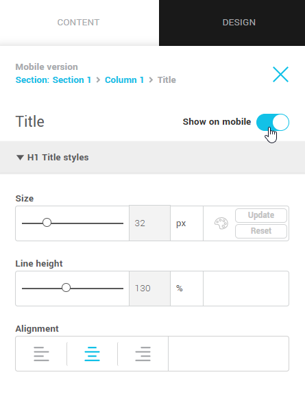
Some elements can be hidden in mobile view to simplify the user experience. To hide an element:
- Switch to mobile mode.
- Click on the element you want to hide.
- In the right panel, open its properties.
- Disable the Show on mobile option.
What happens if all elements in a column are hidden?
If all the elements in a column are hidden, the entire column will automatically be hidden in the mobile display. This prevents unnecessary blank spaces on the page.
Mobile exceptions
When you edit an element in mobile mode, a mobile exception is created. This means the element will keep a different style from the desktop version.
Remove a mobile exception
To remove an exception and return to the desktop version:
- Click the element.
- Click the X on the Mobile button. The element will then return to its desktop appearance.
Spacing in mobile view
By default:
- Section and column spacing is removed.
- An automatic 30 px padding is added around columns to ensure proper alignment and readability.
- Spacing between elements remains the same as in desktop view.
You can customize spacing at any time by selecting the desired element and adjusting margins and inner spacing in its properties.
Testing your mobile version
Use the Preview button to get a quick look at your page on mobile. Click View Online if you want to preview your page using a temporary link before publishing it. Once your page is ready, publish it to make it accessible to everyone.