
In this article:
Adding and enabling the menu
Make it easier to navigate your landing page by adding a customizable menu. Whether you want to guide visitors to different sections of the page (form, feedback section, FAQ) or provide links to downloadable files or a contact email address, the menu helps you organize your content in a clear and user-friendly way.
Perfect for event pages, promotional campaigns, or service presentations, the Menu block is available on all landing pages, whether new or existing. It’s disabled by default, but you can activate and configure it in just a few clicks.
To activate the menu:
- Go to the menu and open your page in edit mode.
- In the Sections panel on the left, enable the menu option and choose a layout.
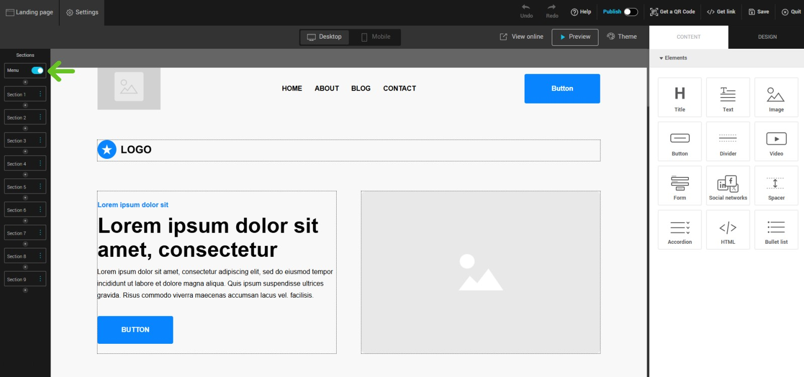
- Drag the menu to the desired location on your page.
Configuring the menu
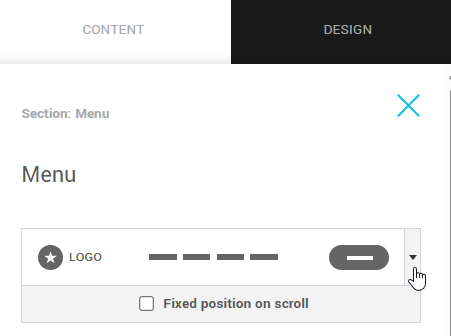
Once the menu is enabled, you can edit it from the settings panel on the right.
This panel is divided into two sections:
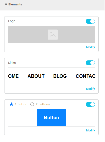
Elements
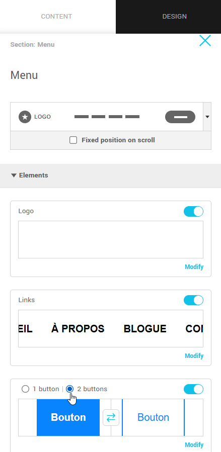
The Elements section allows you to:
- Manage the display of the logo, links, and buttons in the menu
Toggle the switch on or off to show or hide elements. Note that your menu must include at least links or buttons. - Access the properties to customize or edit menu elements
Click on the Edit link or directly on the element to open its configuration and formatting options. - Add a second button and reverse their display order
At the top of the button preview, choose whether to display one or two buttons. Use the arrow between the buttons to reverse their order if needed.
Spacing
Adjust the inner spacing of the menu section in pixels.
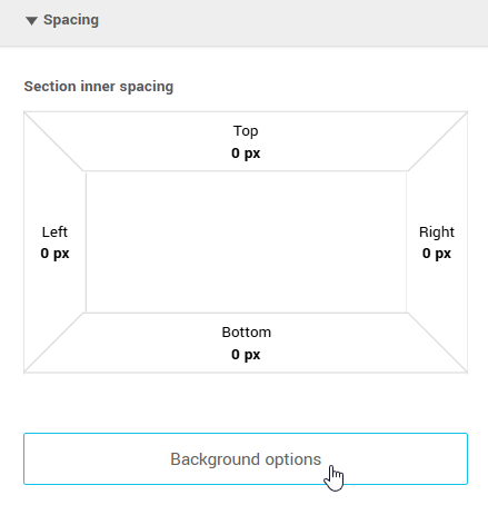
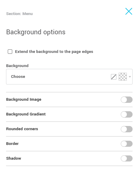
Click the Background options button to access the following settings:
- Extend the background to the page edges.
- Background color: choose a solid color.
- Background image: add an image for extra customization.
- Background gradient: apply a color gradient.
- Rounded corners: set the corner radius for the menu.
- Border: add a border with custom settings.
- Shadow: apply a shadow effect to the menu.
Customize the menu
Here's how to adjust the appearance of your menu elements. Click Edit on the element you want to customize to access its settings.
Types of customization
Add your logo
To add your logo, click Choose an image, then select either My images or the Image library, which offers a variety of visuals. If you need to make adjustments, you can also edit the image directly in our built-in editor by clicking Edit.
Once the logo is added, you can make it clickable by adding a URL and include alternative text. Set its width (in pixels), add a border, apply a shadow, and round the corners if needed. You can also control the spacing around the logo (top, bottom, left, right) for precise placement.
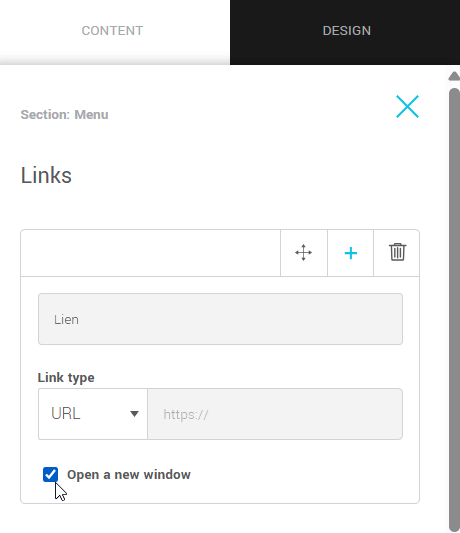
Add, edit, and reorder your links
To add or edit a link, click Edit in the right-hand panel, under Links, in the Elements section, or click directly on the link in the page preview. You’ll be able to enter the link text and define its destination (URL, anchor, file, email address, or phone number). Drag and drop the links to change their order.
Style your links
Go to the Design tab to customize the appearance of your links, spacing, font, and text size.
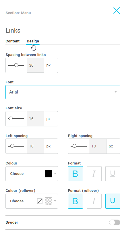
You can also modify their colors (normal and on hover) and add a separator between each link, with customizable thickness and color.
Add links to your buttons and customize their style
Links and buttons can point to different types of destinations: an URL, an anchor on the page, a downloadable file, an email address, or a phone number. They can also redirect to another landing page.
You can also choose to open the link in a new tab.
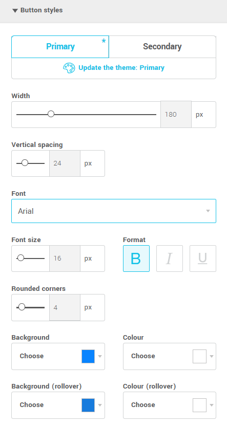
For buttons, you can choose to display one or two, and adjust their order.
Then, customize their appearance: width, font, colors (background and text), rounded corners, borders, and shadow.
Edit the mobile display and settings of the menu
Mobile mode (burger menu)
The mobile menu offers several visual customization options that are separate from the desktop version. The styles you apply in this mode (alignment, colors, icon, spacing, etc.) are specific to mobile and do not affect the browser preview. This allows you to optimize the navigation experience for smaller screens.
The mobile menu offers several customization options.
To access them:
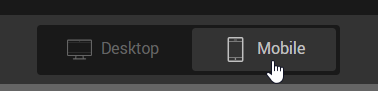
- Click Mobile to open the mobile editor.
- Select the menu to display its customization settings.
Options available in mobile mode
You can customize the appearance of the menu depending on whether it is closed or open.
To switch from one state to another, click the burger menu icon directly in the preview, or click the closed menu or open menu sub-tab located in the right-hand panel.
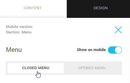
When the menu is closed:
-
Adjust the size of the burger menu icon.
-
Choose the background and foreground colors (icon lines).
-
If needed, adjust the logo size and its position for the mobile version.
-
Modify the spacing around the logo and the menu.
When the menu is open:
-
Adjust the font size and line spacing to improve readability.
-
Show or hide the separator between the links. The separator style will be the same as the one defined for the desktop version.
-
Set the vertical spacing between the links and the space before and after the list of links.
-
Modify the spacing around the buttons for a balanced layout and adjust the button size and font.
-
Adjust the overall spacing around the open menu and customize its background color to match your design.
-
Hide certain links or buttons, for example, if they lead to sections not displayed in the mobile version.
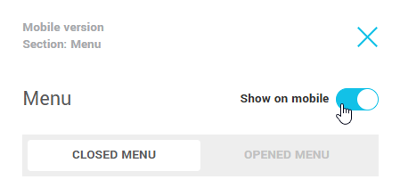
A toggle option also lets you show or hide the menu in mobile mode as needed.
Testing and previewing the final result
Before publishing your landing page, it’s recommended to test your menu to ensure it displays and functions correctly.
Menu preview
Go to the preview of your page to see how the menu will appear to visitors.
- Check how the links and buttons display and behave on hover.
- Ensure all elements are properly aligned and functional.
Test your menu
- Select View online, copy the generated link, and paste it in your browser's address bar to preview how your menu will look on a live web page.
- Make sure the links go to the correct destinations and open properly.